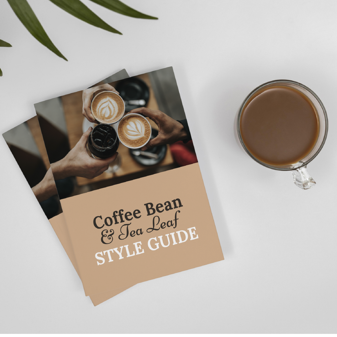
Coffee bean & tea leaf.
The project.
This project was to rebrand an existing company, The Coffee Bean and Tea Leaf. I chose this company because it is a well-known, high-quality brand and has a broad range of products. The idea was to create an updated look that fits into the modern day and still stays true to their original style.
The challenge.
Even with the best intentions, old customers may have a difficult time overcoming their previous knowledge and bias concerning the brand. The goal is to get over that initial hump of skepticism and to re-position the brand in the marketplace.
The solution.
To re-position the brand in the marketplace The Coffee Bean & Tea Leaf had to change their customer’s perspective from “just like any other coffee shop” to “this coffee shop does more than just serve coffee”. I was able to re-position this brand with their point of differences and use those marketing strategies across all platforms. The point of differences are: CBTL is a coffee joint with meals, offering events. They have their own line of cakes and pastries which has been perfected over years of trial and error. CBTL has its own system for brewing beverages that set them apart from other chains and local shops, due to its quality control & consistency. Diverse markets such as Asia where they’ve had success for almost 10 years now adding up to about 400 stores. Additional student discounts & events were two additional ways they managed to attract university students that love their products but are also looking for price reductions in order to save money when it comes time to buying. As a result CBTL was set to a new standard to give their customers a new perspective. Assets included a new logo, style guide, business cards, and other marketign essentials for the brand.
blue 384 tours.
The project.
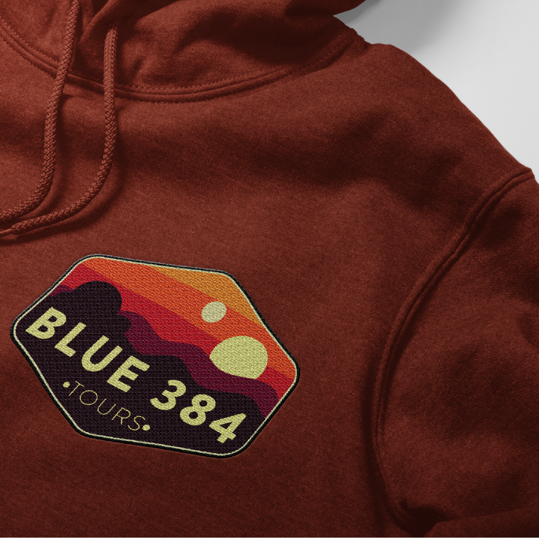
For a class project we were assigned to create a logo for Blue 384 Tours, a hiking tour company.
The results.
The goal for this logo was to capture the high-altitude, adventurous nature of Blue 384 Tours. The logo will be used on the website and other marketing material as well as printed t-shirts, hats, and other merchandise.
Revstat.
The project.
For Medco Services, I had to design a logo for a tool, RevSTAT. RevSTAT is MedCo’s proprietary productivity tool designed to improve efficiencies in all aspects of accounts receivable follow ups. RevSTAT reduces manual data entry and eliminates the need for experienced accounting or billing staff to manually pull claims when they are needed. This tool leverages artificial intelligence and machine learning technologies to predict when the next claim will hit a certain status and notify you when it does, so you can take action quickly before your collection opportunity expires.
The Results.
I designed this logo based on the company’s services and goals. The result is a modern, clean mark that is easily scannable in high-definition formats. This was important to Medco Services because RevSTAT is intended to integrate into a team’s workflow to provide an efficient service when customers need it most. Clean design and vibrant colors also serve as an eye-catching accent to the application banner when used as an icon badge next to Medco’s brand name.
Limited too rebranding.
The project was to rebrand a bankrupt company and turn it around in order to make it a market leader again.
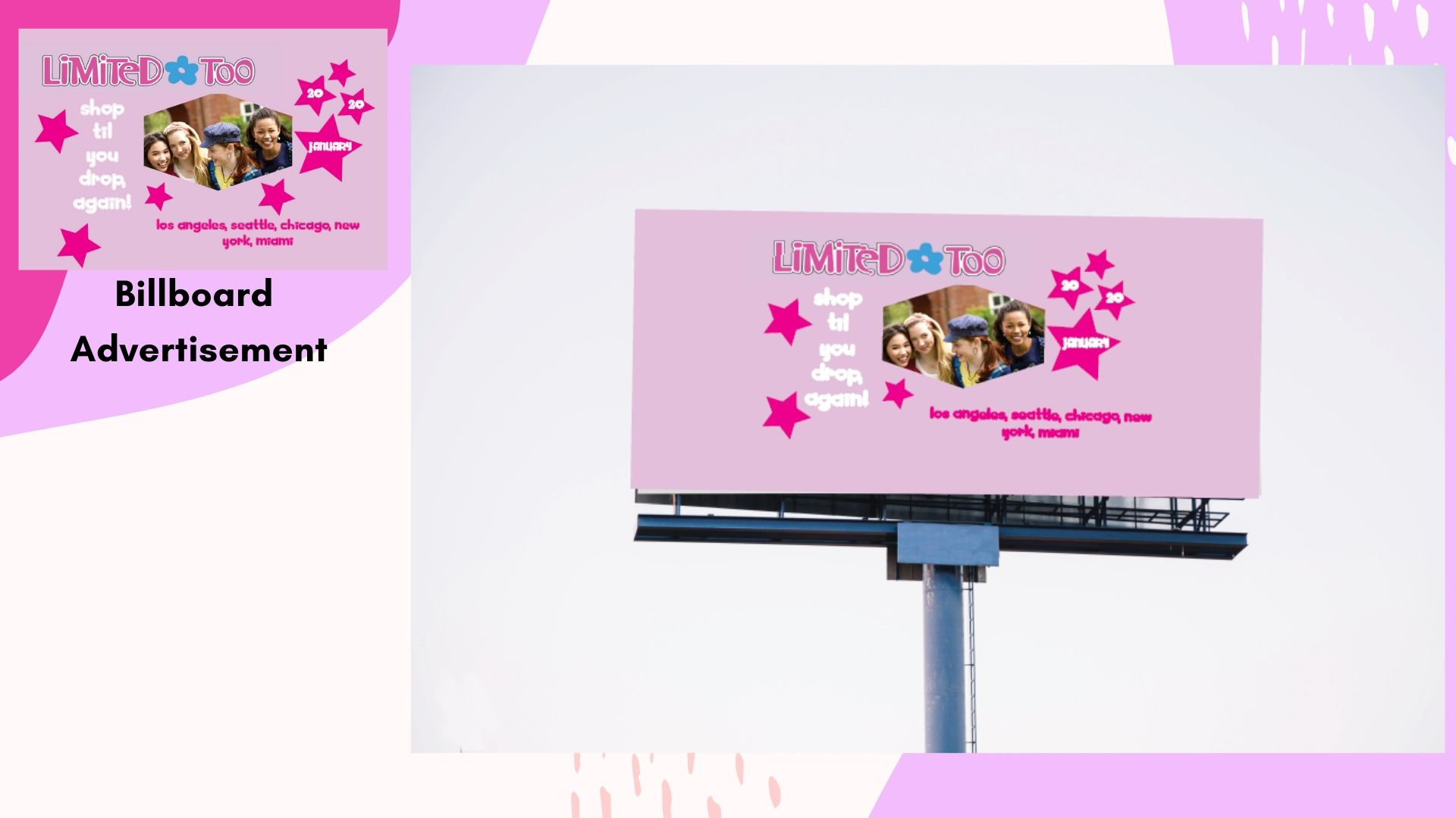
Our team strived to match the personality of the consumer while marketing our products. While we were rebranding Limited Too, consumer needs and interests changed significantly, so we knew it was important to reach them through their preferred channel and also appeal to parents who want to buy their kids quality clothing and keep up with fashion trends. The new ‘Limit the Label’ online store will allow teenagers influence brands through social media marketing campaigns as well as give parents the chance to purchase quality children’s clothes at affordable prices.
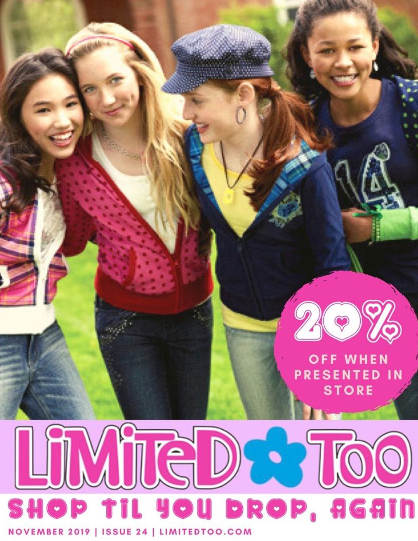
This magazine is designed to appeal to tweens, with all the new fashion trends. The advertisement also appeals to parents by offering 20% off just for reading this ad!
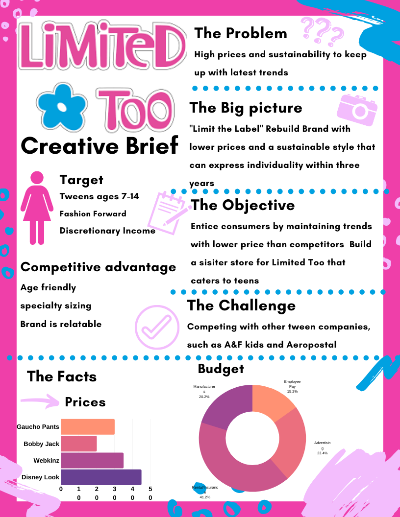
The Creative Brief is a concise document that describes the overall objectives of a project and aligns the details of each deliverable to the business case.
We aim to reintroduce Limited Too to consumers in a way that is exciting and relevant. Our goal is to convert shoppers from competitors who will be attracted by our lower prices. We do this by appealing to a younger demographic since our competitor has stores more focused on older customers. Our sister store will offer stylish teen clothing, accessories and skincare products, in addition to maintaining the same price points as our traditional store.
